Greetings! You must login or signup first!

Cover2

Submission   9,948

Part of a series on Sailor Moon. [View Related Entries]


About

Sailor Moon Pink Color refers to the discourse surrounding the pink tint in the Sailor Moon anime series being an unintentional result of film degradation and not the original artistic vision of the production studio. The discourse achieved virality on social media in mid-January 2024, spawning memes.

Origin

On January 8th, 2024, X / Twitter[1] user @kane_hisa made a tweet about the faded coloration of the 1990s anime series Goldfish Warning! and Sailor Moon, which gave them a pink (or red) tint. The post (shown below, left) received over 310 reposts and 1,600 likes in one week. Later that day, X[2] user @nappasan quoted the post, writing that thinking that the pink tint was an artistic choice should be considered "historical revisionism." The post (shown below, right) received over 680 reposts and 3,200 likes in one week.

かねひさ和哉 @kane_hisa : ビデオソフトの色調が赤すぎる問題といえば『千と千尋』だけど、『きん ぎょ注意報』『セーラームーン』辺りの褪色はもはやその異様に赤みがか った色調が若い視聴者層から「エモさ」として受容されてたりするので、 ちょっとどうなんだと思うところはある When it comes to the problem of video software having excessively red tones, it's “Spirited Away," but the fading colors of "Kingyo Alert" and “Sailor Moon" are no longer accepted by young viewers as "emotional." There are some things that make me wonder what's going on. 7:34 PM・Jan 8, 2024442.3K Views
ΝΑΠΠΑ @nappasan 色褪せていることを承知でそれをセピア調の写真のようにノスタルジアと して味わうのはまあ分かるんですが、 あの真っピンクな色調を当時の制作 者の意図したスタイルであるかのように受容するのは端的に言って歴史修 正主義的なので許容しがたい。 It's understandable that people appreciate the faded color as a nostalgic feeling, like a sepia-toned photo, but it's hard to accept that bright pink tone as if it was the style the creator intended at the time. Simply put, this is a historical revisionism and cannot be tolerated. かねひさ和哉 @kane_hisa Jan 8 ビデオソフトの色調が赤すぎる問題といえば『千と千尋』だけど、 『きんぎょ注 意報』『セーラームーン』辺りの褪色はもはやその異様に赤みがかった色調が若 い視聴者層から「エモさ」として受容されてたりするので、 ちょっとどうなんだ と思うところはある 7:52 PM・Jan 8, 20241.7M Views adhi O'

On January 11th, 2024, @nappasan posted a comparison video in which the current master version of the series was compared against a color-corrected version representing how the series is supposed to look. The post (shown below) garnered over 5,000 reposts and 19,000 likes on X[3] in five days.

Spread

On January 11th, 2024, X[4] user @APE_AHAB quoted the comparison video, writing about the color degradation "accidentally creating an aesthetic." The post (shown below) garnered over 2,200 reposts and 9,100 likes in five days.

ape-ahab @APE_AHAB I always found it interesting how what is effectively film degradation and bad transfers have accidentally created aesthetics unto themselves like the constant reddish tinge of Sailor Moon or the turquoise skies of DBZ NАППА @nappasan. Jan 11 ホワイトバランスやセル画の色を考えるとだいたいこんな感じの色になるはず。 077-10 twitter.com/nappasan/statu... 11:38 AM Jan 11, 2024 274.1K Views : La

On January 12th, X[5] user @dubudavid posted two images of the anime's protagonist Usagi Tsukino / Sailor Moon, one pink-tinted and the other color-corrected, commenting that the anime is not supposed to be tinted. The post (shown below) received over 2,900 reposts and 16,000 likes in four days.

David Miranda @dubudavid I've spoken about the issue briefly before, but yeah, Sailor Moon isn't supposed to be tinted pink. Like most of the anime of that era, whites are supposed to be white. To prefer 1 or the other is up to you, but keep in mind 1 is objectively incorrect/against the original intent. 1:34 AM - Jan 12, 2024 4.1M Views

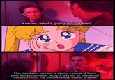
The initial posts inspired a discourse over whether a preference for a color-shifted version of the anime by some fans was a factor to be considered in the necessity for the restoration of the original version. The discovery and the discussions later spawned memes and references. For example, on January 15th, 2024, X[6] user @aalong64 posted a Kramer, What's Going on in There? meme that received over 4,400 reposts and 35,000 likes in one day (shown below).

Kramer, what's going on in there? This 'aesthetic' pink tint is simply a result of Toei's poor film preservation, Jerry. It was not an intentional creative choice. The current official master is faded.

Various Examples

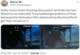
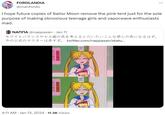
FORDLANDIA @manfordic I hope future copies of Sailor Moon remove the pink tent just for the sole purpose of making obnoxious teenage girls and vaporwave enthusiasts mad. NАППА @nappasan · Jan 11 ホワイトバランスやセル画の色を考えるとだいたいこんな感じの色になるはず。 twitter.com/nappasan/statu... 077- 「整理整頓 整理整顧 : 4:11 AM Jan 13, 2024 11.3K Views
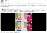
Art-Eater +¥ @Richmond_Lee Time is a flat circle NANA @nappasan Jan 11 ホワイトバランスやセル画の色を考えるとだいたいこんな感じの色になるはず。 今の公式のマスターは赤すぎ。 twitter.com/nappasan/statu... 事予定 予定 12:23 AM Jan 13,2024 222.4K Views
FM Towns Marty Mcflies MARTY @MMcflies >japanese person wants to watch a japanese show the way it was supposed to look >western users pop in & tell him "who cares" + "your opinion doesn't matter" + etc etc are sailor moon fans racist? NАППА @nappasan · Jan 11 ホワイトバランスやセル画の色を考えるとだいたいこんな感じの色になるはず。 072-1. twitter.com/nappasan/statu... 1:24 PM. Jan 12, 2024 127.9K Views :

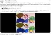
wario @bigwariofan thinking about this again 35mm Trailer - Scan (1999) 16mm Trailer - Scan (1999) DVD/VHS Release (1999) 4K Release - SDR Blu-Ray (2018) 35mm Trailer - Online, SD (1999) 5:05 PM. Jan 11, 2024 4.6M Views 35mm Print - Scan (1999) DVD (2004) Blu-Ray (2008) Release 4K Release - 4K HDR Blu-Ray (2018) Kenny Lauderdale @KennyLauderdal3. Jan 11 So Sailor Moon was color graded wrong this entire time? This is the green skies in Dragon Ball all over again. twitter.com/nappasan/statu... :
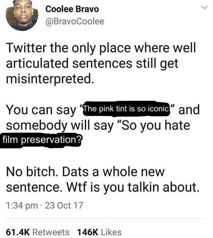
Coolee Bravo @BravoCoolee Twitter the only place where well articulated sentences still get misinterpreted. You can say "The pink tint is so iconic" and somebody will say "So you hate film preservation? No bitch. Dats a whole new sentence. W-- is you talkin about. 1:34 pm. 23 Oct 17 61.4K Retweets 146K Likes
People are talking about Sailor Moon having incorrect colors for the longest time. Wait until people find out that due to the way the NES generates video, there is NO SET COLOR PALETTE for the system. Depending on what you use to play NES games, its colors will be different. ALT GB (gb256.bsky.social) @GB__256 ALT Suren MARIO BROS. ©1985 NINTENDO A 1 PLAYER GAME 2 PLAYER GAME TOP- 000000 Surgit MARIO BROS. ©1985 NINTENDO 1 PLAYER GAME 2 PLAYER GAME TOP- 000000 ALT ALT Surgn MARIO BROS. ©1985 NINTENDO 3:49 PM Jan 13, 2024 370.5K Views A 1 PLAYER GAME 2 PLAYER GAME | SUPER MARIO BROS. ©1985 NINTENDO TOP- 000000 1 PLAYER GAME 2 PLAYER GAME TOP- 000000 :

Search Interest

External References


Share Pin

Related Entries 4 total

Screen_shot_2017-04-05_at_2.58.07_pm
My Job Here Is Done / But You...
Cover3
Sailor Moon Redraw
Sailormoon
Laughing Sailor Moon
Toon_makers_sailor_moon
Toon Makers Sailor Moon / Sab...

Recent Images 19 total


Recent Videos 0 total

There are no recent videos.


Load 40 Comments
Sailor Moon Pink Tint vs. no tint image comparison.

Sailor Moon Pink Tint

Part of a series on Sailor Moon. [View Related Entries]

Updated Jan 17, 2024 at 11:55AM EST by Zach.

Added Jan 16, 2024 at 11:02AM EST by Philipp.

PROTIP: Press 'i' to view the image gallery, 'v' to view the video gallery, or 'r' to view a random entry.

This submission is currently being researched & evaluated!

You can help confirm this entry by contributing facts, media, and other evidence of notability and mutation.

About

Sailor Moon Pink Color refers to the discourse surrounding the pink tint in the Sailor Moon anime series being an unintentional result of film degradation and not the original artistic vision of the production studio. The discourse achieved virality on social media in mid-January 2024, spawning memes.

Origin

On January 8th, 2024, X / Twitter[1] user @kane_hisa made a tweet about the faded coloration of the 1990s anime series Goldfish Warning! and Sailor Moon, which gave them a pink (or red) tint. The post (shown below, left) received over 310 reposts and 1,600 likes in one week. Later that day, X[2] user @nappasan quoted the post, writing that thinking that the pink tint was an artistic choice should be considered "historical revisionism." The post (shown below, right) received over 680 reposts and 3,200 likes in one week.


かねひさ和哉 @kane_hisa : ビデオソフトの色調が赤すぎる問題といえば『千と千尋』だけど、『きん ぎょ注意報』『セーラームーン』辺りの褪色はもはやその異様に赤みがか った色調が若い視聴者層から「エモさ」として受容されてたりするので、 ちょっとどうなんだと思うところはある When it comes to the problem of video software having excessively red tones, it's “Spirited Away," but the fading colors of "Kingyo Alert" and “Sailor Moon" are no longer accepted by young viewers as "emotional." There are some things that make me wonder what's going on. 7:34 PM・Jan 8, 2024442.3K Views ΝΑΠΠΑ @nappasan 色褪せていることを承知でそれをセピア調の写真のようにノスタルジアと して味わうのはまあ分かるんですが、 あの真っピンクな色調を当時の制作 者の意図したスタイルであるかのように受容するのは端的に言って歴史修 正主義的なので許容しがたい。 It's understandable that people appreciate the faded color as a nostalgic feeling, like a sepia-toned photo, but it's hard to accept that bright pink tone as if it was the style the creator intended at the time. Simply put, this is a historical revisionism and cannot be tolerated. かねひさ和哉 @kane_hisa Jan 8 ビデオソフトの色調が赤すぎる問題といえば『千と千尋』だけど、 『きんぎょ注 意報』『セーラームーン』辺りの褪色はもはやその異様に赤みがかった色調が若 い視聴者層から「エモさ」として受容されてたりするので、 ちょっとどうなんだ と思うところはある 7:52 PM・Jan 8, 20241.7M Views adhi O'

On January 11th, 2024, @nappasan posted a comparison video in which the current master version of the series was compared against a color-corrected version representing how the series is supposed to look. The post (shown below) garnered over 5,000 reposts and 19,000 likes on X[3] in five days.


Spread

On January 11th, 2024, X[4] user @APE_AHAB quoted the comparison video, writing about the color degradation "accidentally creating an aesthetic." The post (shown below) garnered over 2,200 reposts and 9,100 likes in five days.


ape-ahab @APE_AHAB I always found it interesting how what is effectively film degradation and bad transfers have accidentally created aesthetics unto themselves like the constant reddish tinge of Sailor Moon or the turquoise skies of DBZ NАППА @nappasan. Jan 11 ホワイトバランスやセル画の色を考えるとだいたいこんな感じの色になるはず。 077-10 twitter.com/nappasan/statu... 11:38 AM Jan 11, 2024 274.1K Views : La

On January 12th, X[5] user @dubudavid posted two images of the anime's protagonist Usagi Tsukino / Sailor Moon, one pink-tinted and the other color-corrected, commenting that the anime is not supposed to be tinted. The post (shown below) received over 2,900 reposts and 16,000 likes in four days.


David Miranda @dubudavid I've spoken about the issue briefly before, but yeah, Sailor Moon isn't supposed to be tinted pink. Like most of the anime of that era, whites are supposed to be white. To prefer 1 or the other is up to you, but keep in mind 1 is objectively incorrect/against the original intent. 1:34 AM - Jan 12, 2024 4.1M Views

The initial posts inspired a discourse over whether a preference for a color-shifted version of the anime by some fans was a factor to be considered in the necessity for the restoration of the original version. The discovery and the discussions later spawned memes and references. For example, on January 15th, 2024, X[6] user @aalong64 posted a Kramer, What's Going on in There? meme that received over 4,400 reposts and 35,000 likes in one day (shown below).


Kramer, what's going on in there? This 'aesthetic' pink tint is simply a result of Toei's poor film preservation, Jerry. It was not an intentional creative choice. The current official master is faded.

Various Examples


FORDLANDIA @manfordic I hope future copies of Sailor Moon remove the pink tent just for the sole purpose of making obnoxious teenage girls and vaporwave enthusiasts mad. NАППА @nappasan · Jan 11 ホワイトバランスやセル画の色を考えるとだいたいこんな感じの色になるはず。 twitter.com/nappasan/statu... 077- 「整理整頓 整理整顧 : 4:11 AM Jan 13, 2024 11.3K Views Art-Eater +¥ @Richmond_Lee Time is a flat circle NANA @nappasan Jan 11 ホワイトバランスやセル画の色を考えるとだいたいこんな感じの色になるはず。 今の公式のマスターは赤すぎ。 twitter.com/nappasan/statu... 事予定 予定 12:23 AM Jan 13,2024 222.4K Views FM Towns Marty Mcflies MARTY @MMcflies >japanese person wants to watch a japanese show the way it was supposed to look >western users pop in & tell him "who cares" + "your opinion doesn't matter" + etc etc are sailor moon fans racist? NАППА @nappasan · Jan 11 ホワイトバランスやセル画の色を考えるとだいたいこんな感じの色になるはず。 072-1. twitter.com/nappasan/statu... 1:24 PM. Jan 12, 2024 127.9K Views :
wario @bigwariofan thinking about this again 35mm Trailer - Scan (1999) 16mm Trailer - Scan (1999) DVD/VHS Release (1999) 4K Release - SDR Blu-Ray (2018) 35mm Trailer - Online, SD (1999) 5:05 PM. Jan 11, 2024 4.6M Views 35mm Print - Scan (1999) DVD (2004) Blu-Ray (2008) Release 4K Release - 4K HDR Blu-Ray (2018) Kenny Lauderdale @KennyLauderdal3. Jan 11 So Sailor Moon was color graded wrong this entire time? This is the green skies in Dragon Ball all over again. twitter.com/nappasan/statu... : Coolee Bravo @BravoCoolee Twitter the only place where well articulated sentences still get misinterpreted. You can say "The pink tint is so iconic" and somebody will say "So you hate film preservation? No bitch. Dats a whole new sentence. W-- is you talkin about. 1:34 pm. 23 Oct 17 61.4K Retweets 146K Likes People are talking about Sailor Moon having incorrect colors for the longest time. Wait until people find out that due to the way the NES generates video, there is NO SET COLOR PALETTE for the system. Depending on what you use to play NES games, its colors will be different. ALT GB (gb256.bsky.social) @GB__256 ALT Suren MARIO BROS. ©1985 NINTENDO A 1 PLAYER GAME 2 PLAYER GAME TOP- 000000 Surgit MARIO BROS. ©1985 NINTENDO 1 PLAYER GAME 2 PLAYER GAME TOP- 000000 ALT ALT Surgn MARIO BROS. ©1985 NINTENDO 3:49 PM Jan 13, 2024 370.5K Views A 1 PLAYER GAME 2 PLAYER GAME | SUPER MARIO BROS. ©1985 NINTENDO TOP- 000000 1 PLAYER GAME 2 PLAYER GAME TOP- 000000 :

Search Interest

External References

Recent Videos

There are no videos currently available.

Recent Images 19 total