Google Plus Redesign / #whitespace
Part of a series on Google Plus / Google+. [View Related Entries]
This entry has been rejected due to incompleteness or lack of notability.
To dispute this DEADPOOL flagging, please provide suggestions for how this entry can be improved, or request editorship to help maintain this entry.
Background
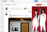
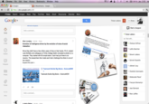
On April 11th, 2012, Google Plus underwent a major redesign[19], revamping its navigation system known as "dynamic ribbon" and enabling larger photos in the the user content stream on Google Plus profile pages. As a result of the redesign, all of the application buttons for different features were moved to a gray side bar on the left side, leaving a large whitespace on the right side of the profile pages. The change was largely reported in the tech news blogosphere[21] as Google's attempt to catch up with Facebook's Timeline feature that was introduced in September 2011.
Notable Developments
Online Reaction
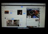
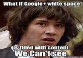
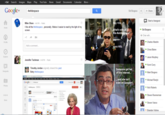
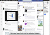
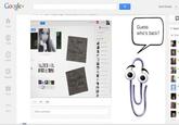
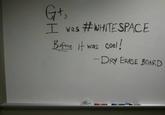
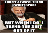
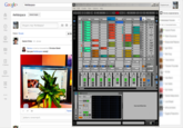
In responding to Google's site update, Google Plus user Christian Martel[23] posted a picture of his profile page on monitor display with a plant covering up the white space on the right side. Martel wrote: "Use your #whitespace wisely!" The post was well received by other users on the site, accumulating 938 likes and 575 shares within the first 24 hours. Soon after, other Google Plus users began sharing clever ways to take advantage of the extra real estate on the profile pages with the hashtag #whitespace and #usersforwhitespace.[20] For more humorous examples, browse KYM Gallery – #Whitespace.


In addition to the image parodies, a web browser plug-in[24] for Google Chrome was made available to allow users to center the new design for optimized display on widescreens. Meanwhile, Google Plus user Jonathan Chalker[22] wrote a fake news article satirizing Google Plus' conspicuous efforts to follow the steps of Facebook:
Google Acquires WhiteSpace For $120M
In a surprise move perhaps intended to counter Facebook's acquisition of Instagram, Google has purchased a little known app company, WhiteSpace, which cleverly adds large, random pockets of white space to any interface.
When asked why WhiteSpace posed an interest, David Lawee, Head of Google's Business Development team responded:
"There are synergies here, the scale of which we don't yet fully understand. The color white, to Google, is like air. WhiteSpace is like air in outer space and everyone agrees it would be cool if there was more air in outer space. It is equally as cool to have more white in our space".
Lawee refused to speculate as to whether WhiteSpace would be added to their new Google Glasses interface.
External References
[19] Google – Toward a simpler, more beautiful Google
[20] Google Plus – Search Results for #whitespace
[21] ZDNet – Google Plus Gets a New Look and Feel
[22] Google Plus – Jonathan Chalker
[23] Google Plus – Christian Martel
[24] Chrome Web Store – Whitespace Remover for Google Plus
Recent Videos
There are no videos currently available.


